Double-click to submit form pattern with Stimulus (revisited)
A follow-up on the double-click-to-confirm button component, now rebuilt as a ViewComponent with a Stimulus sidecar controller. Shows how overlapping text with CSS grid keeps the button width stable during the confirm animation, plus a caveat about long confirmation strings.
Some months ago, I wrote about something I built, a component to submit forms with a double-click, where the user has to confirm the action, potentially avoiding miss-clicks and doing something irreversible by mistake

Ever since then, I have evolved this component a bit, and I think it is in a much better state that it’s worth a “revisited” blog post about it.
The new version
First, I have moved the button to a dedicated ViewComponent object, with a Stimulus controller as a sidecar:
app/components├── application_component.rb├── confirmation_button_component│ ├── confirmation_button_component.html.erb│ └── confirmation_button_component_controller.js├── confirmation_button_component.rb├── index.jsThe content of the confirmation_button_component.rb and the HTML has nothing special
class ConfirmationButtonComponent < ApplicationComponent  def initialize(text:, url:, method:, confirm_text: "Are you sure?", render: true, classes: [])    @text          = text    @confirm_text  = confirm_text    @url           = url    @method        = method    @classes       = Array.wrap(classes)    @should_render = render  end
  renders_one :icon
  attr_reader :text, :confirm_text, :url, :method
  def classes    "button #{@classes.join(' ')}"  end
def render? @should_render endend<%= button_to url, method: method, form: { data: { controller: "confirmationbutton", }, }, data: { turbo_submits_with: "Working...", confirmationbutton_target: "button", action: "click->confirmationbutton#submit", }, class: classes do %> <div class="confirmation-button-content"> <%= icon %> <div class="text-stack"> <span class="text-sm visible" data-confirmationbutton-target="originalText"> <%= text %> </span> <span class="text-sm invisible" data-confirmationbutton-target="confirmText"> <%= confirm_text %> </span> </div> </div><% end %>Here is where things are different now: You noticed that both the text and the confirmation text are present in the HTML at all times, but only one of them is visible at any given time. Now, we replace the classes visible and invisible whenever the button is clicked:
import { Controller } from '@hotwired/stimulus';import { useClickOutside } from 'stimulus-use';
export default class extends Controller {  static targets = ['originalText', 'confirmText', 'button'];  static values = {    clicked: { type: Boolean, default: false },  };
  connect() {    useClickOutside(this, { element: this.element });    this.buttonTarget.addEventListener(      'keydown',      this.cancelWithEscape.bind(this)    );  }
  disconnect() {    document.removeEventListener('keydown', this.cancelWithEscape.bind(this));  }
  cancelWithEscape(e) {    if (e.key === 'Escape') {      this.clickOutside();    }  }
  clickedValueChanged() {    if (this.clickedValue) {      this.originalTextTarget.classList.replace('visible', 'invisible');      this.confirmTextTarget.classList.replace('invisible', 'visible');    } else {      this.originalTextTarget.classList.replace('invisible', 'visible');      this.confirmTextTarget.classList.replace('visible', 'invisible');    }  }
  submit(event) {    event.preventDefault();
    if (this.clickedValue) {      this.buttonTarget.disabled = true;      this.element.requestSubmit();    } else {      this.clickedValue = true;    }  }
  clickOutside() {    if (this.clickedValue) {      this.clickedValue = false;    }  }}
A lot is happening here, so let’s break it down:
clickedValueChangedis an observer provided by Stimulus. Whenever the user clicks (or clicks outside), we change this value, and it swaps classes, displaying one text or another.- I use the keyboard a lot, so I added a
cancelWithEscapemethod. - the
useClickOutsidehasn’t changed from the previous version.
I’m doing all this because now I can play with CSS and make something cool: Keep the button size the same throughout the animation.

There are three things needed for this to work in my case:
- Wrap everything on a parent div (
confirmation-button-content) and center the content. - Wrap the texts on (another) parent div (
text-stack). - Stack’em!
This is what the final CSS looks like
.confirmation-button-content {  @apply flex items-center;}
.text-stack {  @apply grid;  grid-template-areas: 'confirmation';}
.text-stack > span {  grid-area: confirmation;}
The button size will now always be relative to the longest text and won’t shrink when the user clicks.
Using it
The usage now is much easier and much more straightforward:
<%= render ConfirmationButtonComponent.new( text: "Delete", confirm_text: "Confirm?", url: backend_user_path(user), method: :delete, classes: "danger", render: !user.admin? ) do |button| %> <% button.with_icon do %> <%= icon "trash", class: "size-5 me-0.5" %> <% end %><% end %>Caveats
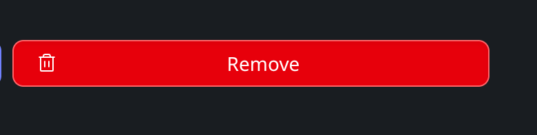
One thing to keep in mind now is the difference between the strings’ lengths. If your confirmation text is much bigger than the regular text, the button looks weird with tons of extra space, e.g, if your confirmation text is something like “Are you sure you want to delete this record?” this is what the button will look like